- Check the axes: time in minutes across, detector response (mAU at the stated wavelength, usually 214 nm for peptides) up.
- Skip the solvent front in the first minute or two; it is not a peak and is not integrated.
- Find the main peak. Its retention time is what an identity match against a reference standard compares, and its share of the integrated peak area is the purity figure.
- Look either side of it for shoulders, pre-peaks and secondary peaks: they are other components, and together they are what the purity figure leaves out.
- Read the method line and the integration table, then confirm the lot and certificate number match the vial and the issuing laboratory’s record.
The plot
A chromatogram is a line graph. The horizontal axis is time in minutes from the moment the sample enters the column. The vertical axis is detector response, usually absorbance in milli-absorbance units (mAU) at a stated wavelength; peptide reports are normally run at 214 nm because the peptide bond absorbs there. Each component of the sample reaches the detector at a characteristic time and shows up as a peak. The plot is the raw evidence behind the purity figure on the front page of the report.
Reading it left to right
- Solvent front. A small disturbance in the first minute or two, sometimes a negative-going spike, is the unretained solvent passing the detector. Laboratories exclude it from integration.
- Baseline. The flat line between peaks. Flat means the instrument was equilibrated and the integration is trustworthy; drifting or noisy means small peaks are hard to separate from noise.
- Main peak. The tallest peak, which should be the material named on the label; its position on the time axis is the retention time. Sharp and symmetric indicates good chromatography; a shoulder or split top suggests a closely eluting impurity.
- Secondary peaks. Smaller peaks before or after the main one are other components: incomplete sequences, oxidation products, or process residues. Their positions relative to the main peak are consistent under the same method, which is how a laboratory recognises a known impurity.
- Late region. Peaks well after the main one are more strongly retained components, sometimes aggregates or hydrophobic residues; a tail of tiny peaks here is common and usually totals a fraction of a percent.
Annotated walk-through: two published Arctic lot reports
Both reports were issued by ILS Laboratories (San Diego, CA) and are linked from the batch COA library. Every number here is taken from the report PDF; where the PDF does not state something, this page says so.
BPC-157 5mg, lot BCP-2502-B
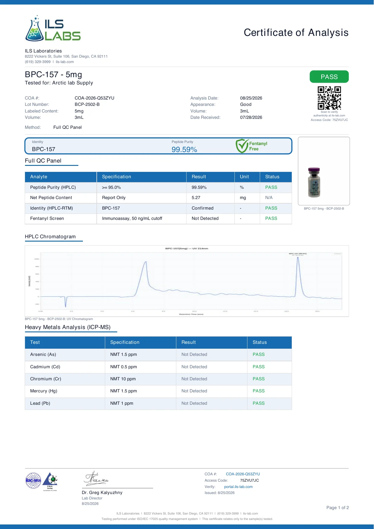
The plot is titled BPC-157 (5mg) — UV 214nm, retention time in minutes across, intensity in mAU up. Left to right:
- Start of run. A narrow negative-going spike: the solvent-front disturbance. Not a peak, not integrated.
- A broad early feature. Roughly a third of the way across the window the trace rises into a wide, tailing hump and settles slowly back toward baseline. The method note states that purity is the target peptide relative to all peptide-related peaks and that non-peptide process-related impurities are excluded. The report does not itemise this feature, so the PDF and the laboratory's verification record are the authority on it; what the plot shows is that the laboratory displayed the full window rather than cropping it.
- Main peak. Near the right of the window, a tall, narrow, symmetric peak labelled BPC-157 with its area percentage. Reported result 99.59% against a specification of at least 95.0%. The identity line reads HPLC-RTM, Confirmed: the peak's retention time was matched to a reference standard under the same method.
- Net peptide content. Listed separately as 5.27 mg against a labelled 5 mg; a different measurement from area percent, as explained below.
Listing: BPC-157 5mg. Report pattern for this material: BPC-157 identity, purity and stability.
GHK-Cu 50mg, lot GHK-2501-B
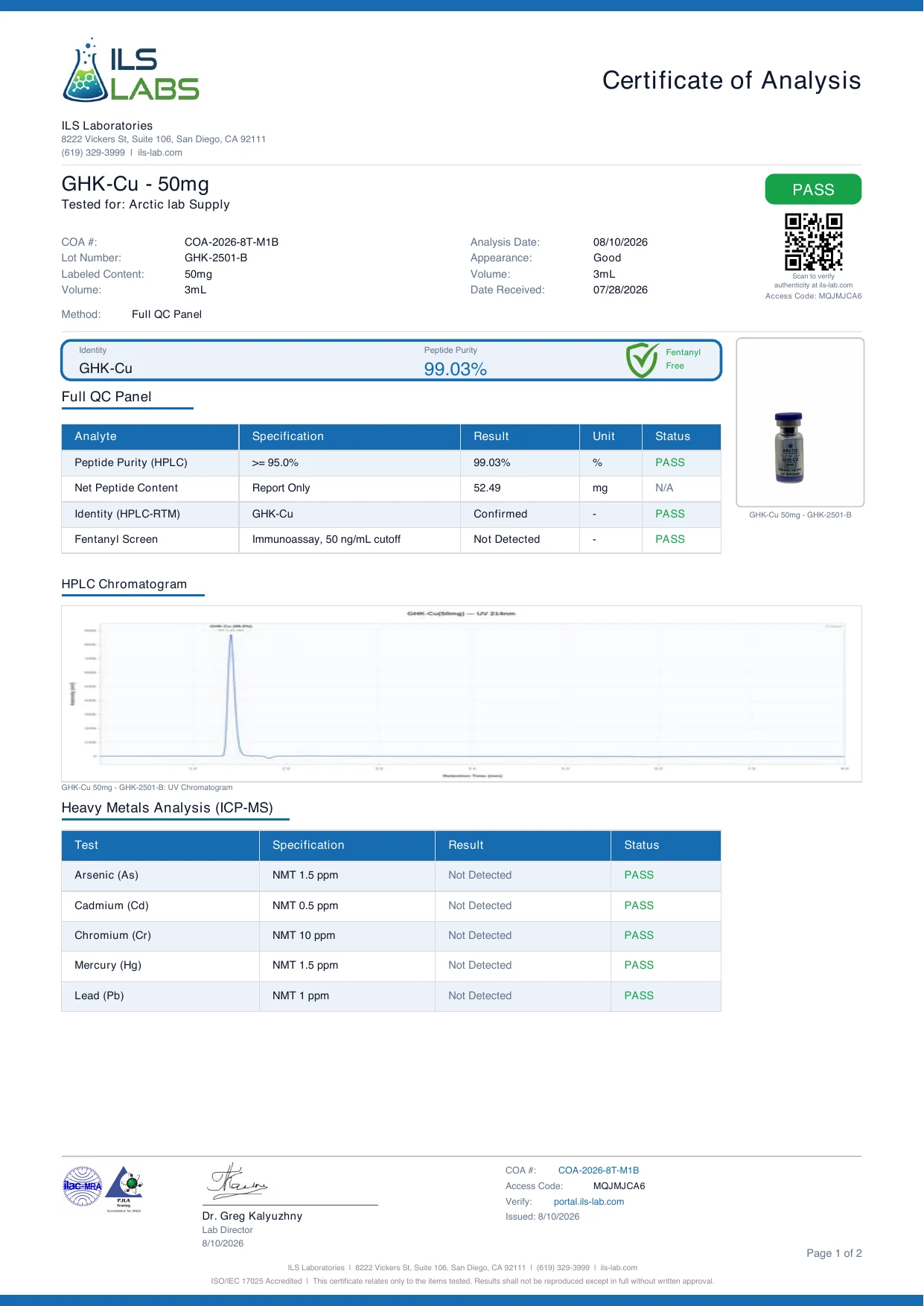
Same laboratory, same wavelength, a different-looking trace. The GHK-Cu plot covers a much shorter time window and the main peak sits early in it. GHK-Cu is a copper-complexed tripeptide, small and comparatively polar, so it is retained less on a reversed-phase column than a 15-residue chain like BPC-157. The peak is sharp and symmetric, with a small dip at its base and a flat baseline to the end of the run. Reported result 99.03%, identity HPLC-RTM, Confirmed, net peptide content 52.49 mg against a labelled 50 mg.
Listing: GHK-Cu 50mg. Lot comparison: GHK-Cu identity, purity and lot comparison.
Two traces from one laboratory with different time windows, peak positions and baseline shapes are both correct: retention time is a property of the peptide and the method. Neither certificate prints the column dimensions or gradient programme; both state the wavelength, the normalisation rule, and that identity was established by retention-time comparison with a reference standard.
How area percent is computed
The integration software draws a baseline under each peak and computes the area between trace and baseline, usually in mAU·s. Area percent for a peak is its area divided by the sum of all integrated peak areas, times 100. The purity figure is the area percent of the main peak.
A worked example with two peaks, using illustrative numbers that are not from any report:
| Peak | Retention time (min) | Area (mAU·s) | Area % |
|---|---|---|---|
| Pre-peak (impurity) | 11.8 | 15,000 | 15,000 ÷ 2,000,000 × 100 = 0.75% |
| Main peak | 12.4 | 1,985,000 | 1,985,000 ÷ 2,000,000 × 100 = 99.25% |
| Total | 2,000,000 | 100.00% |
Three things follow. The denominator matters as much as the numerator: excluding the solvent front, non-peptide residues or a late system peak raises the figure, so the report must say what was excluded (both Arctic reports do). Small peaks near the detection limit carry the uncertainty; a 0.1% peak on a noisy baseline could be 0.05% or 0.2% depending on where the baseline is drawn. And a shoulder lumped into the main peak inflates purity, while one split off deflates it.
Why area percent is not weight percent
Area percent is a ratio of detector responses. At 214 nm the detector responds to peptide bonds, so a component's area depends on how many chromophores it carries and how much is present, not on its mass. A deletion sequence one residue short of the target has almost the same response per molecule; a small fragment may barely register; water, salts and the trifluoroacetate counter-ion do not appear in the peptide-related peak set at all.
That is why the reports list net peptide content as a separate line. For lot GHK-2501-B the area purity is 99.03% and the net peptide content is 52.49 mg; for lot BCP-2502-B the figures are 99.59% and 5.27 mg. Neither is derived from the other: one says of the peptide the detector saw, this share was the target, the other this is how much peptide was in the vial. See net peptide content for the second measurement and what purity percentages mean for the first.
What shoulders, pre-peaks, secondary peaks and baseline drift usually indicate
None of these is a verdict on its own. Each is a pattern with a short list of usual causes on a synthetic peptide.
| Feature | Looks like | Usual causes on a synthetic peptide |
|---|---|---|
| Shoulder on the main peak | Bump on the leading or trailing side of the apex, no separate baseline return | A component eluting within tenths of a minute of the target: a single-residue deletion sequence, a diastereomer from racemisation during coupling, or a residual protecting group. Integration must draw a line through it, so the area figure is less certain. |
| Pre-peak | Small resolved peak shortly before the main peak | Something slightly more polar than the target. Oxidation is the classic case: methionine sulfoxide or oxidised tryptophan elutes earlier on reversed phase. Deamidation and some deletion sequences also land here. |
| Post-peak | Small resolved peak shortly after the main peak | Something slightly more hydrophobic: a residual protecting group, an extra residue from double coupling, or an aggregate. Cyclic and linear forms of one sequence also separate here. |
| Rising baseline | Trace climbs smoothly across the run | Trifluoroacetic acid absorbs at 214 nm and its apparent absorbance shifts with the organic fraction; detector warm-up and column bleed add to it. Expected if smooth. |
| Baseline step or slope break | Sudden offset or kink not tied to a peak | An instrument event: pressure change, bubble, autosampler artefact. Peaks integrated across it are approximate. |
On the TFA counter-ion: most synthetic peptides are supplied as trifluoroacetate salts because TFA is the standard ion-pairing agent in purification. It is not a peptide, is excluded from the peptide-related peak set, and shows up in the solvent front and baseline rather than as a secondary peak. It does add to the mass in the vial, one more reason area percent is not weight.
Retention-time drift between lots and between laboratories
Retention time is reproducible only under a fixed method. Change any of the following and the same peptide moves:
- Column. Stationary-phase chemistry (C18, C8, phenyl), particle size, pore size, length and internal diameter all change retention. Two C18 columns from different manufacturers rarely give identical times.
- Gradient. Start and end organic fraction, slope in percent per minute, and the system's dwell volume set where a peptide elutes. A shallower gradient pushes everything later.
- Temperature. Column temperature shifts retention per degree and changes selectivity between close peaks, which is why a good method states it.
- Mobile phase. The ion-pairing agent (TFA or formic acid), its concentration, the pH, and the organic modifier (acetonitrile or methanol) all alter retention; formic-acid methods give broader, later peptide peaks than TFA methods.
- Flow rate. Scales the time axis directly.
The rules that follow:
- Two lots of the same material from the same laboratory under the same method should agree in main-peak retention time within a few hundredths of a minute; a larger shift is a question for the laboratory, not automatically a defect. The pattern of secondary peaks should also look alike, and a new peak absent from the earlier lot is the most informative difference a chromatogram can show.
- Two laboratories using different columns or gradients will not agree, and nothing is wrong. Compare relative retention (impurity position relative to the main peak) rather than absolute minutes.
- Identical retention time is not something to demand. Consistent method reporting is: wavelength, and ideally column, gradient and temperature, stated on each report so a difference can be explained.
- Retention time alone does not prove identity. It is a match against a reference standard under one method, which is what HPLC-RTM, Confirmed means on the Arctic reports. Mass spectrometry answers a different question; see HPLC purity versus mass-spectrometry identity. The rest of the document is covered in how to read a certificate of analysis.
Checklist: what a complete HPLC section of a COA must show
- The chromatogram itself, with labelled time and response axes, not just a number.
- The detection wavelength (214 nm on both Arctic reports above).
- The main peak identified on the plot with its retention time.
- The purity result as area percent, with the normalisation rule stated: what was included in the denominator and what was excluded.
- The acceptance specification the result was judged against (at least 95.0% on the reports above).
- An identity result with its method and reference (HPLC-RTM against a reference standard, or a mass-spectrometry result).
- Net peptide content reported separately, so that area percent is not mistaken for weight.
- Method conditions where published: column, gradient, temperature, flow rate, mobile phase. If absent from the certificate, they should be available on request.
- The lot number, the analysis date, the issuing laboratory, and a certificate number that can be checked on the laboratory's own portal.
If a report you are reading is missing items 1, 3 or 4, you do not have a purity result; you have a claim.
Frequently asked questions
- What does the purity percentage on an HPLC chromatogram actually measure?
- Main-peak area divided by the summed area of all integrated peptide-related peaks, as a percentage: a ratio of detector responses, not a weight fraction.
- Why is area percent not the same as weight percent?
- At 214 nm the detector responds to peptide bonds, so area scales with chromophore count rather than mass, and water, counter-ions and non-peptide residues are excluded. That is why net peptide content is a separate line.
- Do two lots of the same peptide need identical retention times?
- No. Same method, same instrument: expect agreement within a few hundredths of a minute. Different laboratories: expect a difference and read relative retention instead. What is required is a stated method and a match to a reference standard.
- What does a shoulder on the main peak indicate?
- A second component the method has not resolved from the target, most often a deletion sequence, a diastereomer, or a residual protecting group. The area figure carries more uncertainty than a clean single apex would.